Project Overview
Developed a dynamic, interactive product dashboard designed to showcase and analyze the Nike Air Jordan lineup. The project focuses on bridging the gap between high-fidelity product visualization and data-driven metrics, providing a seamless user experience (UX) for browsing footwear specifications, pricing, and customer sentiment.
Key Features
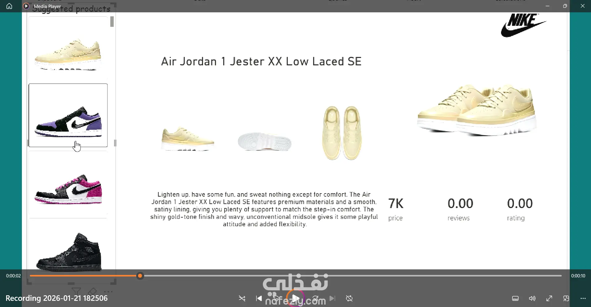
Dynamic Product Navigation: Implemented a "Suggested Products" sidebar allowing users to switch instantly between different models (Low, Mid, Jester XX).
Real-time KPI Tracking: Built live data cards for Price (e.g., 18K), Review Count, and Rating Scores (e.g., 9.20) that update based on the selected item.
Multi-Angle Visual Gallery: Integrated a 360-degree visual approach, displaying the profile, top-down, and outsole views for every sneaker model.
Contextual Data Storytelling: Linked each product to its unique historical description and material specifications (e.g., "Satin lining," "OG AJ1 heritage").
Clean & Intuitive UI: Designed a minimalist interface that prioritizes product aesthetics while maintaining high data readability.
Implementation Approach
Data Structuring: Organized product metadata (titles, descriptions, and technical specs) into a structured format for easy retrieval.
Interactive Logic Design: Developed the "Active State" logic where clicking a sidebar thumbnail triggers a global update of the central stage.
Visual Asset Management: Curated and optimized high-resolution PNG assets to ensure fast loading times and a premium look.
Front-end Integration: Applied layout principles to ensure the balance between text (descriptions) and numerical data (KPIs).
UI/UX Validation: Tested transitions and selection states to ensure the interface responds instantly to user input without lag.
Tools & Technologies
UI/UX Design | Data Visualization | Interactive Prototyping | Product Data Management | Digital Storytelling