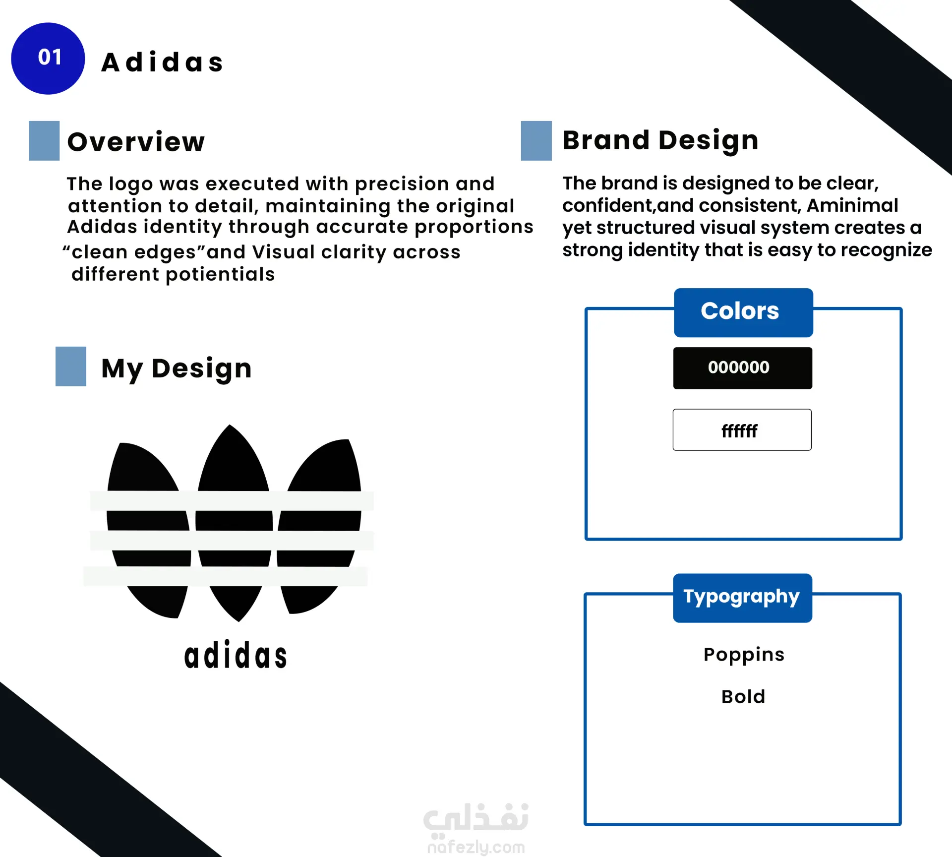
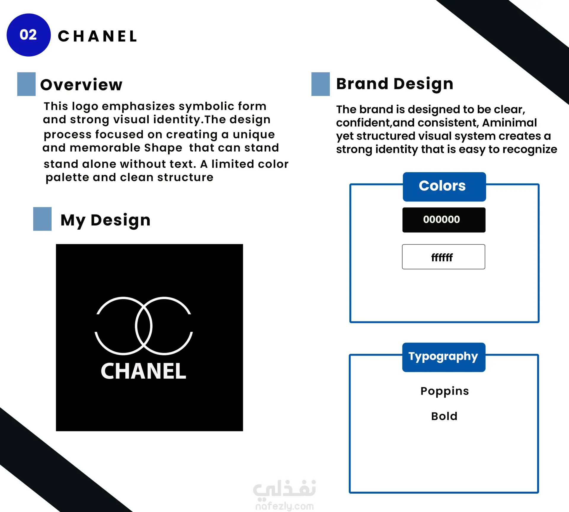
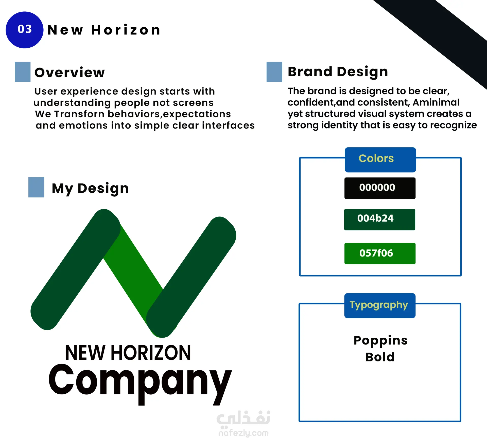
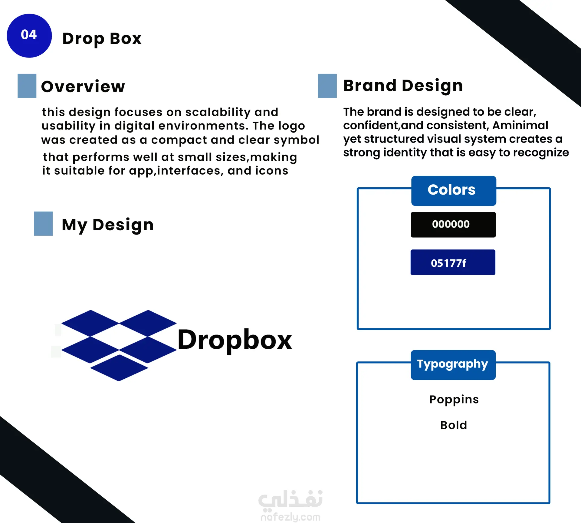
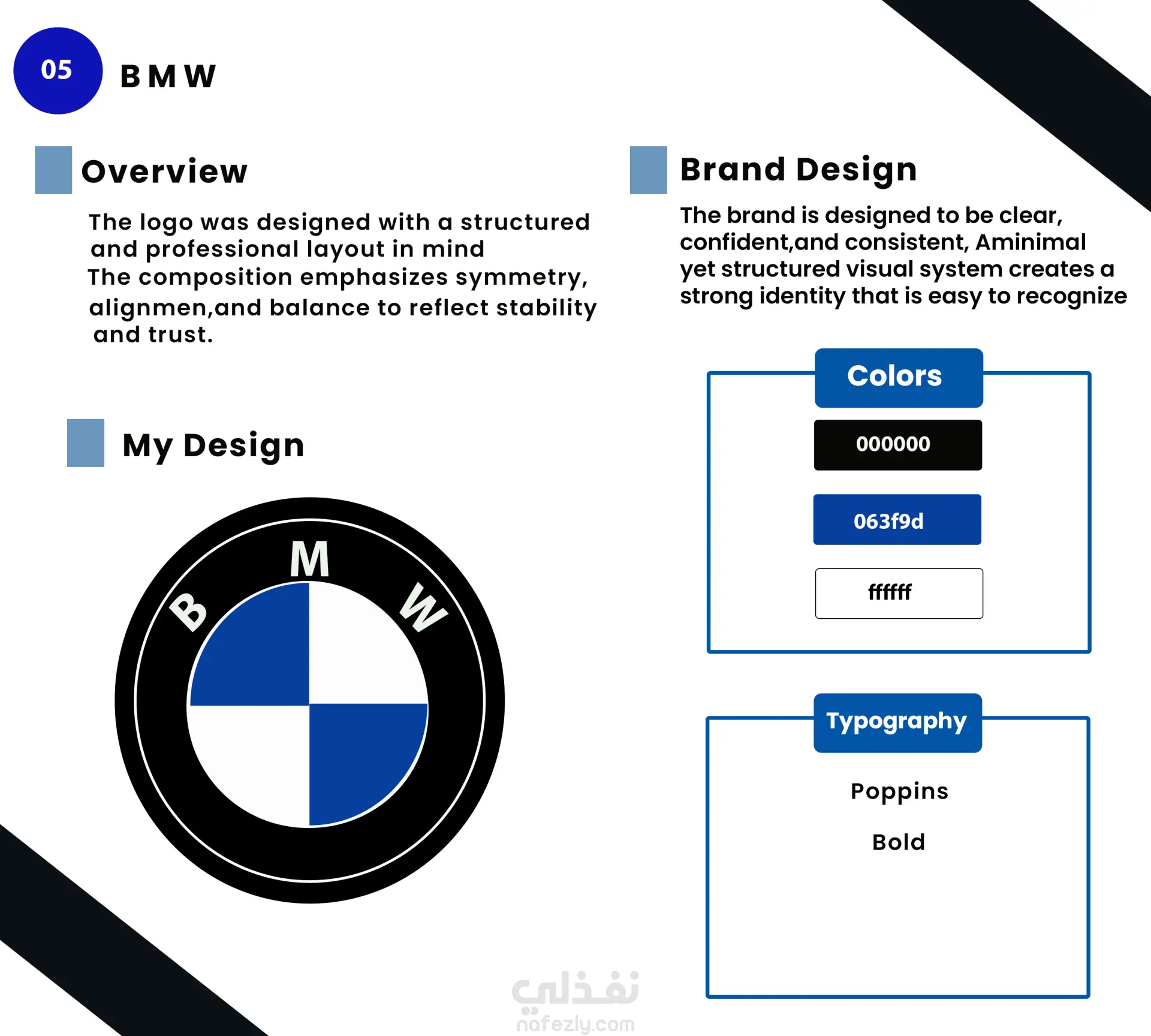
This project presents a Logo Case Study featuring a collection of 5 logo designs developed with a focus on clean structure and visual balance. The concept highlights the importance of symmetry, alignment, and strong visual identity to create recognizable and modern brand marks.
The design process includes exploring color harmony, typography, and geometric composition to ensure each logo reflects clarity, stability, and brand consistency.
The selected color palette combines black, white, and blue tones to convey professionalism, trust, and simplicity.
This case study demonstrates how thoughtful design decisions can build memorable and effective brand identities.