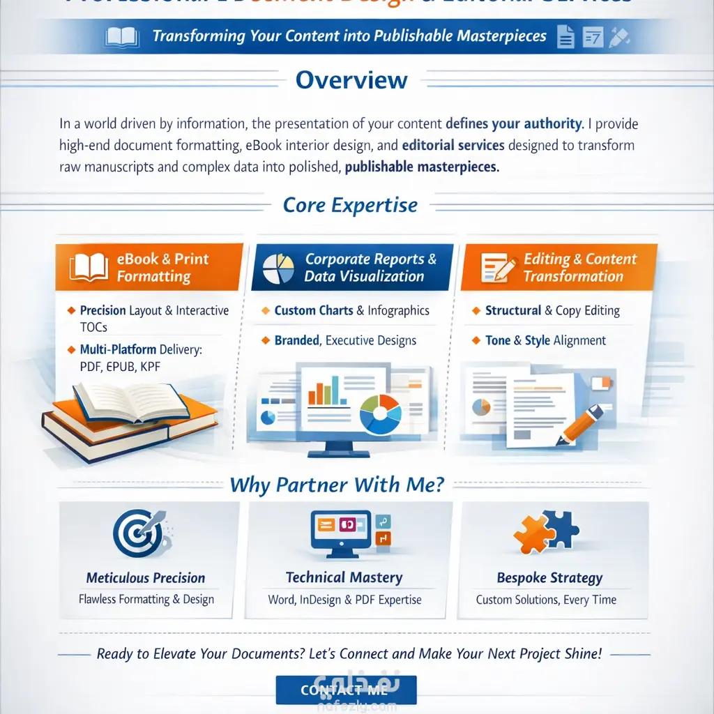
In this project, I redesigned the World Happiness Report to transform complex statistical data into an engaging and easy-to-read document. I focused on visualizing dry numbers through interactive-style charts that allow readers to grasp global comparisons and key indicators (Social Support, GDP, Freedom) at a glance.
Key Highlights:
Data Visualization: Converted dense statistical tables into colorful, organized bar charts and geographical maps.
Content Architecture: Structured the report with an executive summary followed by regional analysis, using clean visual breaks.
Typography & Layout: Utilized modern fonts and a professional grid system to ensure clarity across all sections.
Thematic Branding: Selected an "uplifting" color palette that reflects the theme of happiness while maintaining a formal corporate standard.