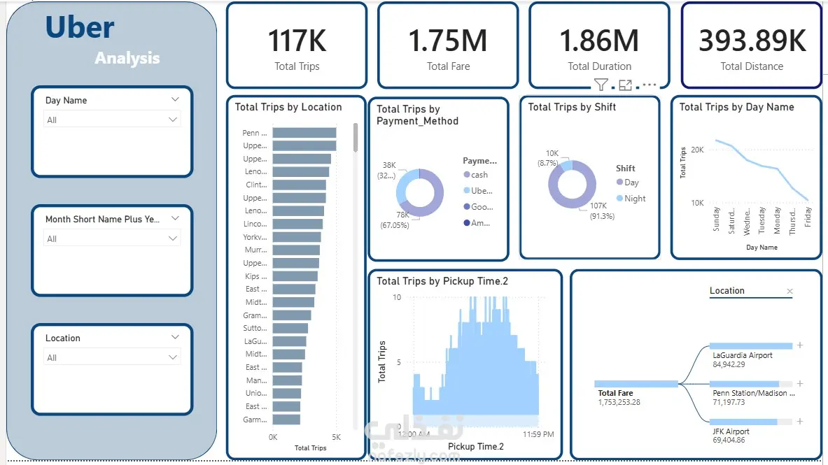
This project showcases an interactive Uber Data Analysis Dashboard created using Power BI. The dashboard provides clear insights into Uber trips, including total trips, fare, duration, and distance. It also highlights trip distribution by location, shift, payment method, and pickup time, with dynamic filters for day, month, and location. This visualization helps users easily identify patterns, monitor performance, and make data-driven decisions.