Bank customers analysis
تفاصيل العمل
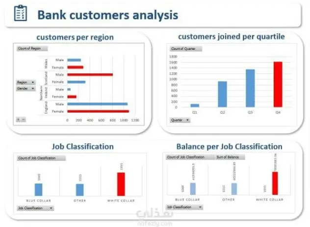
Dashboard Components The analysis is broken down into four distinct charts: 1. Customers per Region (Top Left) This chart uses a segmented horizontal bar chart to analyze the Count of Customers broken down by Region and Gender (Male/Female). Key Insight: The highest number of customers appears to be in England, followed by Scotland, with customers in Wales and Northern Ireland being significantly fewer. Within most regions, there is a clear distinction in the count of male versus female customers (e.g., in England, the number of male customers is noticeably higher than female customers). 2. Customers Joined per Quartile (Top Right) This chart is a vertical bar chart showing the Count of Customers who joined the bank in each of the four fiscal Quarters (Q1, Q2, Q3, Q4). Key Insight: Customer acquisition appears to be accelerating throughout the year, with a consistent increase from Q1 to Q4. Quarter 4 (Q4) has the highest count of new customers, suggesting the bank's customer joining activity peaks at the end of the year. 3. Job Classification (Bottom Left) This chart is a vertical bar chart showing the Count of Customers across three main categories of Job Classification. Key Insight: The largest customer segment by count is the 'WHITE COLLAR' classification (indicated by the tall red bar), followed by 'BLUE COLLAR' and 'OTHER.' 4. Balance per Job Classification (Bottom Right) This chart presents two distinct values for each Job Classification group: the Count of Job Classification (presumably the customer count, repeating the data from the chart on the left) and the Sum of Balance for that group. Key Insight: While 'WHITE COLLAR' customers are the largest group by count (left bar of each pair), the 'Sum of Balance' (right bar of each pair, shown in red) is significantly higher for the 'WHITE COLLAR' group compared to the 'BLUE COLLAR' and 'OTHER' groups. This indicates that 'WHITE COLLAR' customers contribute the most to the bank's total deposit balance, despite the 'OTHER' and 'BLUE COLLAR' segments having large aggregate balances themselves. This dashboard serves as a great tool for a bank to quickly understand its customer demographics (Region, Gender) and acquisition trends (Quartile), as well as the financial value (Balance) associated with different Job Classification segments.
مهارات العمل
بطاقة العمل

طلب عمل مماثل