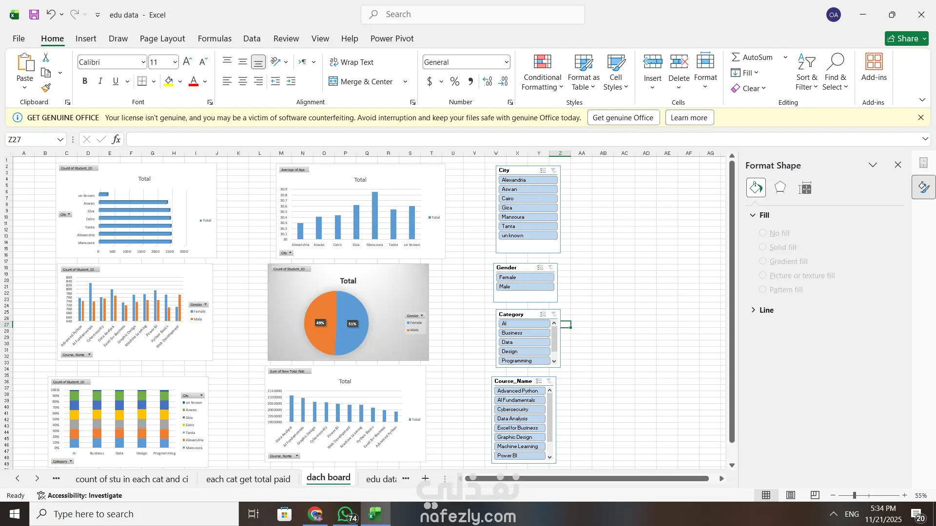
Data Segmentation: The analysis is segmented by several key variables:
City: Alexandria, Aswan, Cairo, Giza, Minoufiya, Tanta, and 'unknown'.
Gender: Female and Male.
Category: AI, Business, Data, Design, and Programming.
Course Name: A detailed list of specific courses like Advanced Python, Fundamentals, Cybersecurity, Data Analysis, and Power BI.
Visualizations: Multiple chart types are used to present the findings:
Bar Charts/Column Charts: Used to show the "Count of students" and "Average of students" across different categories (e.g., enrollment by city, count by course category and gender).
Horizontal Bar Charts: Used to compare the "Count of student" or "Count of payment" for specific courses.
Donut/Pie Chart: Used to show the percentage distribution of a total (e.g., 44% vs. 56% for gender or category distribution).
Stacked Column/Bar Chart: Used to show the contribution of different categories (like cities) within each course category.
Metrics: The analysis includes metrics such as:
Count of student: Total enrollment numbers.
Average of student: Likely the average performance or grade.
Sum of total paid: Financial metrics related to course fees.
Worksheets: The bottom tab bar shows the workbook is likely divided into specific analyses, including "count of stu in each cat and ci," "each cat get total paid," and "dash board."