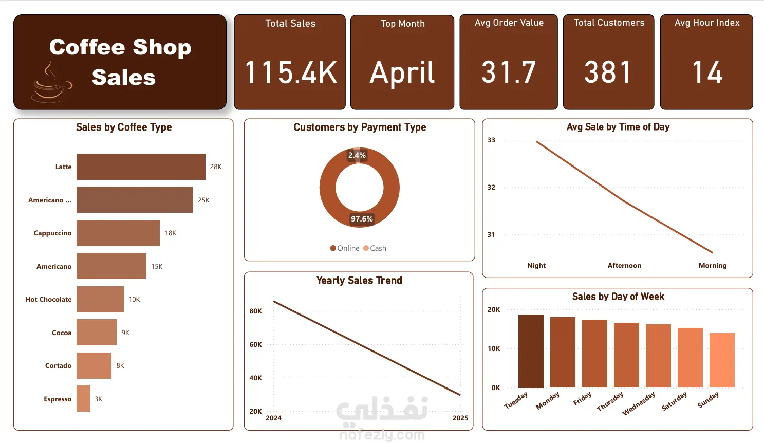
I created an interactive dashboard to analyze and visualize coffee shop sales using Power BI.
The dashboard highlights key performance metrics, including:
Total sales and top-performing month
Average order value and total customers
Sales by coffee type and payment method
Yearly sales trend
Sales by day of the week and time of day
The goal was to transform raw data into a clear and visually engaging report that supports better business decisions.
I used consistent formatting and a coffee-inspired color palette to give the dashboard a clean and professional look.