🎬 Visualizing Insights from Netflix Data 📊
تفاصيل العمل
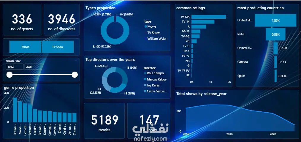
I recently built this interactive dashboard to explore trends within Netflix’s vast content catalog — uncovering insights about genres, directors, viewer ratings, and global production patterns over time. 💡 Key Highlights: Analyzed 5K+ titles and 3K+ directors Visualized genre proportions and country-wise production Explored release trends and common viewer ratings Highlighted top-performing directors over the years This project strengthened my skills in data visualization, storytelling, and dashboard design using [insert tool — e.g., Power BI / Tableau / Python Dash]. I aimed for a clean navy-inspired theme to balance aesthetics and insight clarity. 🙏 A huge thank you to my instructors for their constant support and guidance throughout this project — your feedback truly helped me refine my analytical thinking and design approach. Excited to keep turning raw data into meaningful stories! 🚀 #DataVisualization #Netflix #PowerBI #DashboardDesign #DataAnalytics #DataStorytelling #Visualization #LearningJourney #Gratitude Would you like me to make the thank-you part more personal and heartfelt (for example, naming your instructors or focusing more on mentorship), or keep it professional and concise like this? You said: write a smmary or description about this project to put on portfolio ChatGPT said: Here’s a concise and polished project description you can include in your portfolio: Netflix Data Visualization Dashboard This project focuses on analyzing and visualizing insights from Netflix’s content dataset using interactive dashboards. The goal was to uncover meaningful patterns in content production, genres, ratings, and release trends through clear and engaging visual storytelling. Key Features: Analyzed 5,000+ titles and 3,900+ directors to identify global production trends. Visualized genre distribution, common ratings, and release-year performance. Highlighted top directors and most active production countries. Designed a modern navy-themed dashboard emphasizing readability and aesthetics. Tools & Skills Used: Power BI / Tableau (or specify your tool) Data Cleaning & Transformation Data Visualization & Storytelling Dashboard Design Principles Outcome: Delivered an interactive dashboard that provides a clear overview of Netflix’s evolving content landscape, showcasing data-driven insights in a visually appealing and user-friendly manner.
مهارات العمل
بطاقة العمل

طلب عمل مماثل