Telecome Customers Overview Analysis Dashboard
تفاصيل العمل
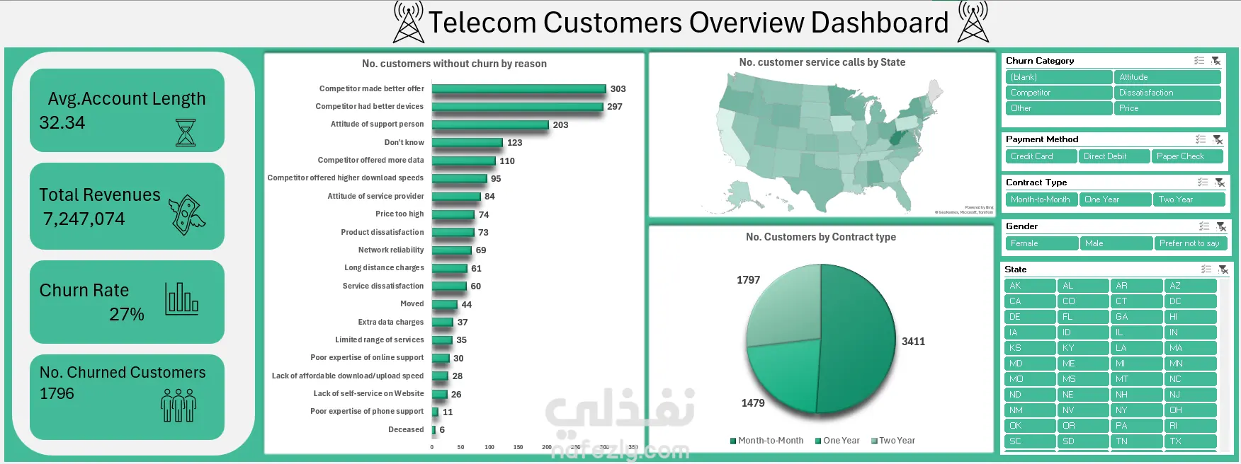
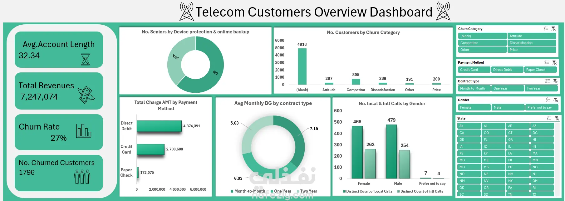
Telecom Customer Dashboard – Built in Excel I recently created this interactive dashboard using Microsoft Excel to analyze customer data from a telecom company. The dashboard provides a clear overview of key performance metrics and customer behaviour. What this dashboard highlights: Churn Rate: 27% – that’s 1,796 customers lost. ⏳ Average Account Length: 32.34 months. Total Revenue: $7,247,074. The dashboard covers: Top reasons customers are leaving, such as better offers or devices from competitors, and dissatisfaction with support. Customer distribution by contract type (Month-to-Month, One-Year, Two-Year). Payment methods breakdown and total revenue by method. Call activity by gender and state. Churn categories including Attitude, Price, Competitor, and Dissatisfaction. Senior customers' usage of device protection and online backup services. This project demonstrates how Excel can be a powerful tool for data visualization and business decision-making, especially when handling customer insights and retention analysis.
مهارات العمل