Data Population Visualization

تفاصيل العمل
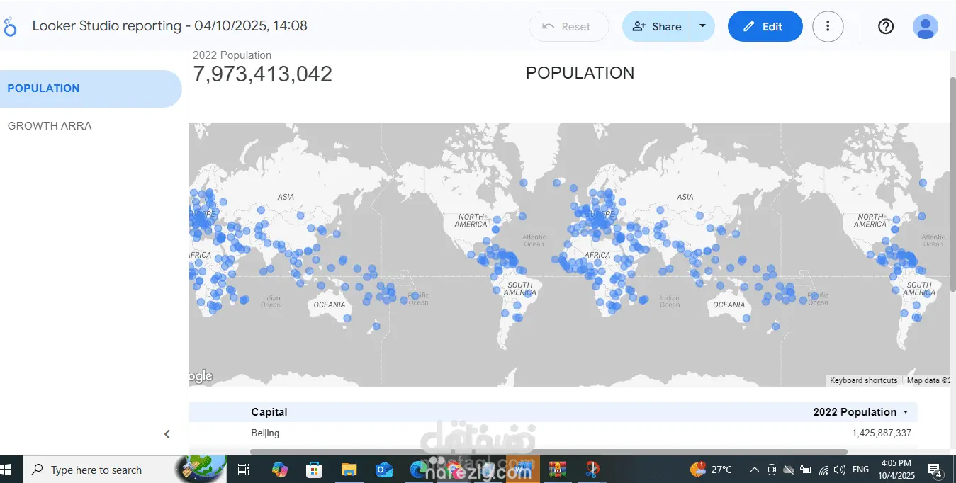
Portfolio Structure: Data Population Visualization You should organize your portfolio entry around these key sections: 1. Project Title & Overview A catchy title and a brief, one-sentence summary of the project. 2. The Challenge/Goal What was the purpose of this dashboard? (e.g., To make complex global population data accessible, identify regional trends, or compare growth rates across continents). 3. Data Source and Tools Clearly state where the data came from and the tools you used. Data Source: World Population Data (or similar, specify the source if known) Tools: Looker Studio (for visualization), Google Sheets/BigQuery (for data preparation/storage, if used). 4. Technical Skills Demonstrated This is the most important section for a potential employer. Show what you did, not just what the tool can do. Data Transformation: How did you clean, structure, or calculate new metrics (like density or growth rate) from the raw data? Data Modeling: How did you blend or connect different data sources? (Even if it's just one source, mention connecting it to Looker Studio.) Visualization Design: Justify your chart choices (e.g., "Used Geo Map for immediate regional comparisons," "Used Time Series Chart to show the trend of global growth"). 5. Key Insights and Impact What is the "aha!" moment users get from the dashboard? What are two or three interesting things a user can learn from your work? Example Insight: "Identified that while total population is highest in Asia, the fastest rate of growth over the last decade is concentrated in specific countries in Africa." Sample Portfolio Write-up Global Population Trends Dashboard (Looker Studio) This project showcases the design and implementation of an interactive dashboard for visualizing global demographic data, allowing users to explore population size, density, and growth rates across continents and countries. Project Goal The primary goal was to transform complex, tabular world population statistics into an accessible, interactive, and aesthetically pleasing data story. This dashboard serves as a tool for quick analysis, enabling users to effortlessly identify regional population leaders, track historical growth, and compare demographic metrics. Data Source and Tools Data Source: Publicly available global population data (e.g., UN World Population Prospects, World Bank, etc.) Tools: Looker Studio (Dashboarding and Visualization), Google Sheets (ETL/Data Prep and Storage). Technical Skills Demonstrated Cloud Visualization: Expert use of Looker Studio to design an multi-page, interactive report. Geospatial Mapping: Implemented the Geo Map visualization to display population density and total count by country, providing an immediate visual understanding of global distribution.
مهارات العمل
بطاقة العمل

طلب عمل مماثل