I dived deep into the world of content streaming and developed two comprehensive Power BI dashboards for Disney+ and Netflix. These visualizations help draw some interesting comparisons between the two platforms in terms of content trends, genres, and distribution.
tools used:
Data Cleaning: We used Power Query to preprocess and clean the data, ensuring accuracy and consistency.
Data Querying: SQL Server was leveraged to write and execute complex queries to extract meaningful insights from the raw data.
Dashboard Building: Power BI was the primary tool used to design and develop interactive dashboards, providing clear visualizations for comparing the content libraries of Disney+ and Netflix.
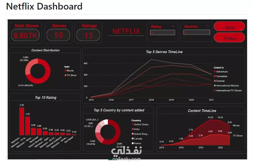
🚀 Key Insights :
Content Distribution: *Disney+ has around 1,450 titles , while Netflix boasts a whopping 8,807 titles! *Disney+ features 77.6% TV shows, highlighting its focus on series.
Genre Trends: *Family and Animation dominate Disney+ , whereas Netflix offers a broader range, with strong Drama and Comedy genres .
Content Addition Trends: *A timeline analysis reveals significant spikes in content additions, especially during major releases . *The U.S. leads in content creation for both platforms .
Customer Segmentation by Ratings: *Analysis of ratings (e.g., PG, 18+, G) indicates distinct audience targeting strategies for both platforms, with Disney+ focusing more on family-friendly content .
Director and Cast Insights: *Key directors and actors contributing to both platforms were highlighted, showcasing industry talent.